Kite and Key explain how and why US and Canada electricity is on the brink of blacking out when needed. For those prefering to read, below is a transcript with my bolds and some added images.
Five seconds. That’s about how long you’ve been watching this video. And in 2025, it was also the amount of time it took for 60 percent of the electricity supply in Spain … to vanish from the country’s grid. Which led to 10 hours of darkness — in parts of four countries. It’s a nightmarish scenario — and there’s a good chance that it’s coming to America soon.
Electricity. It’s the backbone of our entire world.
Your house. Your town. Your … excessive enthusiasm for Christmas. We build our lives around the assumption that when we flip a switch, it’ll be there for whatever we need — whether it’s controlling the climate in our homes, refrigerating our food, or just making sure the neighbors can see you’ve portrayed Santa committing a class B felony.
And, when you consider the history, you can see just how quickly we’ve gotten used to this. When Thomas Edison opened America’s first commercial power plant in 1882, it served 59 customers in lower Manhattan.ii By the time another 40 years or so had passed, America’s electricity consumption looked like this:iii
By 1929, the U.S. was generating more power than the rest of the world combined.iv And in the century since, our appetite has only grown. In 2025, the government’s Energy Information Administration reported that the country consumed 14 times more electricity than it had in 1950.v
All of which sounds like a standard story of progress: As the decades pass, and technology evolves, things that once seemed miraculous become so commonplace that we can take them for granted.
But here’s the thing: We should definitely not be taking them for granted. Because the days of assuming we know what’s going to happen when we flip the switch … may be coming to an end.
In 2023, members of the Federal Energy Regulatory Commission — the government body that regulates electricity transmission — appeared before a Senate committee with a series of dire warnings.
One of them testified that “We face unprecedented challenges to the reliability of our nation’s electric system.”vi
Another said that “The United States is heading for a very catastrophic situation in terms of reliability.”vii
And then he added “This problem is coming. It’s coming quickly. The red lights are flashing.”viii
And while we don’t like to editorialize here at Kite & Key … that sounds bad.
The data shows that these concerns aren’t exaggerated.
In 2026, the North American Electric Reliability Corporation — the body charged with making sure that the power grid is dependable — warned that nearly half of America’s population was going to be at high risk of rolling blackouts in the next few years.ix
In fact, by the end of the decade every single region of the U.S. and Canada is projected to be at least elevated risk … with the single exception of the Canadian province of Saskatchewanx — which makes sense because Saskatchewan literally has more cows than people.xi
So, if there’s a blackout there … well, you know what happened.
But all of this leads to an obvious question: How does this happen? It’s been almost 150 years since Thomas Edison got the ball rolling and somehow we’re getting worse at this? What’s going on here?
To unravel this mystery, go back to those officials testifying before Congress.
One of them summed up the problem in four words: “The math doesn’t work.”xii
Here’s what he meant by that: In many cases we’re actually losing power — as in, we’ll have less of it in a few years than we do now.
Take, for example, the PJM Interconnection, the country’s largest power grid operator, which serves 65 million customersxiii in 13 states.xiv
In 2023, PJM issued a report estimating that it might lose about 40 gigawatts of electricity — more than 20 percent of its capacity — by the year 2030, thanks to power plant retirements.xv
Which isn’t the end of the world, right? You just bring on new power sources! Which is what they’re doing!
Here’s the problem: The high-end estimate of those new sources … is a little over 30 gigawatts.
In other words, they’re replacing 40 … with 30.
Also known as: “The math doesn’t work.”
And similar situations are happening all over the country.
Why? Well to understand that, we have to understand how the economics of electricity works.
And you might be thinking “But, Kite & Key, that sounds excruciatingly boring.” And it is, dear viewer!
Or at least it would be if you hadn’t chosen the one channel that understands it’s so boring that you have to explain it with the assistance of adorable puppies dressed as economists.
Here’s the way this all goes down: In any given part of the country, you might have lots of potential sources of electricity — natural gas, solar, coal, wind, nuclear. And at any given moment all those sources are selling power at different prices.
Now, the decision as to which one to use is not made by you, the customer. It’s made by the people responsible for coordinating the system, who take bids from electricity producers — sometimes as often as every five minutes — and buy whatever options are cheapest at the time until they’ve got enough power to meet demand. None of which seems crazy — adequate energy at low prices is pretty much what everyone wants.
But here’s where this gets complicated: In some cases … cheap electricity comes with unintended consequences.
Here’s what we mean.
Not all energy sources are created equal.
Map of Diminishing Capacity Values for Major RTOs (Regional Transmission Operators)
Some of them like nuclear and most coal plants are what’s referred to as “baseload power” — they can essentially run all the time.
Others like natural gas plants are “dispatchable,” meaning you can quickly turn them on or off depending on demand.
Then there are sources like wind and solar which are “intermittent” — in other words, you only get power from them when the weather is cooperating.xvi
And this is where the problem creeps in.
In 2024, the government reported that wind, on average, only produces energy about 1/3 of the time.xvii For solar, it was less than 1/4 of the time.xviii By contrast natural gas was around 60 percent and nuclear was at 90 percent.xix
But when wind and solar are working they can be incredibly cheap. In fact, because they’re heavily subsidized by the government, their prices can actually go negative — they can pay the grid to take their powerxx — and still stay in business.
Needless to say, all the other electricity producers … can’t do that.
Which makes them less profitable.
Which leads an increasing number of them to close.
Which leads to a world where we’re increasingly dependent on
electricity sources that literally don’t produce any energy most of the time.
Those 40 gigawatts PJM may lose? Almost all coal or natural gas. The up to 30 gigawatts that will partially replace it? Mostly wind and solar.xxi
Which is the kind of thing that leads otherwise boring bureaucrats from places like the Federal Energy Regulatory Commission to yell “the red lights are flashing!” at members of Congress.
Because by privileging the energy sources that work the best some of the time
… we’re gutting the energy sources that work the best all of the time
— the ones that actually determine whether you’ll have power.
There’s no doubt that wind and solar are going to be important parts of America’s energy future. But imagining that they can carry the burden of the entire system today is risking disaster.
When wind and solar can’t produce, we rely on sources like nuclear, natural gas, and even coal to keep the lights on.xxii But if we cut out that part of the equation — if we don’t build to ensure resiliency — we’re placing our standard of living on a knife’s edge. And if we get that balance even slightly wrong, well…
I won’t do a transcript of the video, since many will reconginize text and images from reading various postings here. Content at this blog is arranged into categories relating to the themes discussed. See Guide to Science Matters
There will be a part 2 discussion in August on two additional themes relating to global warming/climate change.
Update: Below are downloads of Slides from Part 1 Podcast
Note: Clicking on a red link above will download a pptx presentation file which can be opened in powerpoint or compatible application. Once opened, select the slide show menu and then “from current slide”, which will be the first one. The slides will then be full screen, and some with gif images will display the animations.
I won’t do a transcript of the video, since many will reconginize text and images from reading various postings here. Content at this blog is arranged into categories relating to the themes discussed. See Guide to Science Matters
There will be a part 2 discussion in August on two additional themes relating to global warming/climate change.
Green Energy is a mirage that retreats as you approach.
Terigi Ciccone wrote an Open Letter to Ed Ballard Re: “Why Green Energy Makes More Sense With Each Price Shock” (WSJ, April 9, 2026). Excerpts in italics with my bolds and added images.
Open Letter to Ed Ballard Re: “Why Green Energy Makes More Sense With Each Price Shock” (WSJ, April 9, 2026)
Dear Mr. Ballard,
I have sent you several detailed emails over the past few years outlining the engineering and economic realities of integrating variable renewable energy (VRE). You have never replied. Your latest column—celebrating the Iran/Hormuz crisis as yet another “proof” that solar-plus-battery is now the rational choice—is the latest example of journalistic cheerleading that substitutes press-release optimism for rigorous system-level analysis. As a power-plant design engineer with decades of hands-on experience specifying dispatchable generation, I write this open letter to correct the record, not in theory, but in the hard language of capital costs, ancillary services, capacity factors, and ecological externalities that your piece airbrushes away.
Your star exhibit is the Philippines’ MTerra Solar project: 3.5 GW solar + 4.5 GWh battery storage, fast-tracked amid LNG shortages, now supposedly delivering 13 hours of power “marginally below” LNG cost. You quote Actis investor Rahul Agrawal: “This is not theory. This is actually happening on the ground now.” Indeed, it is—but the ground truth is far uglier than your narrative admits.
1. Intermittency is not a rounding error; it is the dominant cost driver. Even with batteries, MTerra is engineered for ~12–13 hours of mid-merit output. The remaining 11–12 hours (and any multi-day typhoon-induced lull) still require dispatchable backup. My own peer-reviewed analysis of ancillary-service burdens shows that adding solar and wind to a reliable grid inflates total system costs by 135–235 % once frequency regulation, inertia, voltage support, and ramping are properly valued. The raw LCOE of ~$40/MWh becomes a delivered cost of ~$500/MWh. See: Terigi Ciccone, “A Narrow Lens on Ancillary Services: Overlooking the Full Costs and Ecological Damage of Solar and Wind Integration”
2. The “phenomenal” price drop in Chinese panels and batteries is a geopolitical trap, not progress. You correctly note falling panel costs, but you fail to mention that China controls ~85% of solar manufacturing and ~80% of the battery supply chain. Swapping Middle-East oil dependence for Beijing’s critical-mineral monopoly and state-subsidized overcapacity is not energy security; it is energy servitude. When those subsidies or export policies shift, the “cheap” becomes expensive overnight.
3. Full-system costing reveals multipliers your LCOE ignores. Economist Bjørn Lomborg has repeatedly documented the same reality using Value-Adjusted LCOE (VALCOE). A peer-reviewed study he cites shows that once reliability and backup are included, wind power becomes 11–12× and solar up to 38–42× more expensive than combined-cycle gas turbines (CCGT). Bjørn Lomborg, “Why solar and wind power aren’t winning,” Financial Post, 17 April 2024 (Identical findings appear in Lomborg’s“The True Cost of Wind and Solar Energy,” NH Journal, 20 May 2024.)
Figure 4 – International Domestic Electricity Prices (p per kWh). UK has the highest domestic electricity prices in the IEA.
My own comparison of 1 GW reliable output at 99.9 % uptime reaches the same conclusion: onshore wind requires 5.6× and offshore wind 7.2× the capital investment of a CCGT, once overbuild, storage, transmission, and peaker plants are added. See: Terigi Ciccone, “The Well Hidden and Distorted Costs of Renewables:A Comprehensive Comparison of Wind Power and Combined Cycle Gas Turbine Plant”
Typically as wind and solar power share of supply increases, distribution and transmission costs rise sharply.
4. Academic “System LCOE” literature confirms the same directional truth— Falko Ueckerdt, Lion Hirth, and colleagues introduced System LCOE precisely because standard LCOE is misleading at high VRE penetrations. Their 2013 analysis (and subsequent updates) shows integration/profile costs can equal or exceed generation costs themselves once wind shares exceed ~20 %. At the levels now being forced, those costs become an economic barrier. Ueckerdt et al., “System LCOE: What are the costs of variable renewables?”Energy 63 (2013) 61–75
5. Ecological and material externalities are catastrophic. Your column is silent on land use (10× that of nuclear or gas for equivalent firm power), avian/bat mortality, 78 million tons of non-recyclable solar waste projected by 2050, and the concrete-steel-copper footprint of batteries that must be replaced every 8–12 years. My third paper tallies these hidden costs in full. See: Terigi Ciccone, “Revised: Let’s Make Electricity Affordable Again”
Moreover, the raw-material demands are staggering. Utility-scale solar and wind installations consume vastly greater quantities of concrete, steel, copper, silver, rare-earth elements, and other minerals per unit of firm, reliable electricity than any dispatchable source. This triggers massive mining operations with severe habitat destruction, water contamination, and toxic tailings. Manufacturing these components remains overwhelmingly dependent on fossil fuels for the energy-intensive processes of silicon purification, steel smelting, and mineral extraction. In full life-cycle terms, many VRE systems may never recover the total primary energy invested in their construction, installation, maintenance, and eventual replacement—rendering the entire enterprise an energy and cost sink rather than a net contributor.
Drone footage shows hundreds of solar panels ripped apart and scattered across farmland after a powerful tornado tore through Wheatfield overnight. Homes in the area also suffered heavy damage as the violent storm carved a path of destruction. Photo credit Joemar Sombero
6. Real-world stress tests expose the fantasy.Philippine typhoons shred solar farms; Florida hurricanes do the same. After every major storm, we see acres of twisted panels and batteries that cannot survive Category 4 winds. Yet the same voices warning about climate risk keep prescribing an energy system that collapses precisely when the weather turns ugly.
7. Ultimately, we are inflicting these enormous costs for no good reason. The entire policy edifice rests on the assumption that anthropogenic CO₂ is the primary driver of dangerous warming. In reality, CO₂’s greenhouse effect is already near saturation in its principal absorption bands; additional emissions yield only minuscule marginal forcing. The true temperature powerhouses on Earth are gravitational auto-compression (the dry adiabatic lapse rate driven by atmospheric mass and pressure) and the dominant water-vapor/latent-heat cycle, which together govern the vast majority of Earth’s energy balance.
We are dismantling reliable, dispatchable power systems, subsidizing
foreign supply chains, and covering productive land in fragile panels
—all to chase a trace-gas tail that cannot wag the climatic dog.
8. Increased atmospheric CO₂ is demonstrably greening the planet. NASA satellite data confirm that rising CO₂ has driven substantial global greening over recent decades. The increase in leaf area is equivalent to twice the size of the continental United States, with CO₂ fertilization responsible for approximately 70 % of this greening across 25–50 % of vegetated lands. Far from harming the biosphere, higher CO₂ levels are enhancing vegetation growth, boosting agricultural yields, and expanding natural habitats worldwide.
9. Humans are not the sole source of rising atmospheric CO₂. As I document in detail in “Revised: Let’s Make Electricity Affordable Again,” natural sources—including volcanic activity, oceanic degassing, and other geological processes—play a far more significant role in the global carbon cycle than the prevailing narrative acknowledges. Attributing nearly all recent increases to human emissions oversimplifies complex geophysical realities and ignores the “Volcanic Vibes” that have shaped atmospheric CO₂ long before industrial civilization.
Mr. Ballard, energy crises do not “hammer home” the virtues of green energy. They expose its fatal engineering defects: zero inertia, negative correlation with demand, dependence on foreign supply chains, and an energy return that fails even basic life-cycle scrutiny. The rational response is an all-of-the-above portfolioanchored by dispatchable, high-capacity-factor sources—modern CCGT, nuclear (including SMRs), and geothermal—with targeted renewables only where they demonstrably lower system cost without compromising reliability.
Your repeated refusal to engage with the peer-reviewed literature or
practicing engineers suggests a commitment to narrative over evidence.
I invite you, once again, to reply—publicly or privately—and defend your claim that solar-plus-battery “makes more sense with each price shock” once full system costs, ecological and material realities, geopolitical risks, and the actual physics and benefits of atmospheric CO₂ are included. Until then, this open letter stands as the record of your April 9 column that you omitted. Let’s bury the narrative. 🔥
Respectfully but firmly, Terigi Ciccone Ret. Gas Turbine Engineer for power generation and aviation, an independent researcher on climate, Sarasota, Florida, USA
There’s been much ado about a strong El Niño, but less is heard about the appearance of a sister anomaly Atlantic Niña. What happens to summer storm activity when both are on stage? Ben Cost does a good job of pulling together the implications in his NY Post article El Niño’s sister La Niña has arrived in the Atlantic — here’s what that means for summer weather. Excerpts in italics with my bolds and added images.
The extremely strong El Niño brewing in the South Pacific isn’t the only unusual weather pattern on the horizon. Meteorological experts warn that the oceanic anomaly’s sister — Atlantic Niña — could be rearing its head in the tropical part of The Pond, potentially helping curtail the number of storms we’ll see this season, according to Severe Weather Europe.
A map of global sea surface temperature anomalies on July 15, 2026, shows a significant region of below-average sea surface temperatures off the western coast of Africa.
This climate pattern is similar to La Niña — the cold phase of the El Niño Southern Oscillation (ENSO) — in that both cause temperature plunges below average. The difference is that this big chill affects the eastern equatorial Atlantic Ocean instead of the central and eastern equatorial Pacific, potentially altering wind and rainfall across the tropics, per Climate.org.
These two anomalies appear to work on opposite poles (warm vs. cold), but they are actually perfectly aligned in their atmospheric impact.
Should surface temps on the Atlantic Ocean hover at 0.9 degrees Fahrenheit below average for at least two overlapping seasons, this could mark just the sixth Atlantic Niña in the last four decades.
The sibling anomaly El Niño, meanwhile, causes preternaturally warm temperatures on the Pacific Ocean’s surface with forecasters predicting that this particular version could be up to 6.5 degrees warmer than average, potentially making it the strongest El Niño on record.
Despite being polar opposites on the thermometer, these temp-affecting twins are “perfectly aligned in their atmospheric impact,” long-range forecaster Andrej Flis wrote for Severe Weather Europe.
This means that both will help curb hurricanes — but in different ways. El Niño produces high wind shear and sinking dry conditions over the Atlantic and Caribbean — where wind shear is already the second highest on record for July — potentially nipping the storm systems in the bud, according to Weather.com.
Of these, only four are projected to become hurricanes, while just one will attain Category 3 status or stronger, marking five fewer storms and three fewer hurricanes than an average season.
El Niño’s sister system, meanwhile, literally throws cold water on cyclones. Cooler ocean temps in the Atlantic prevent the heat and moisture buildup required for thunderstorm buildup, according to The Conversation.
It will be interesting if these sibling systems have double the preventive impact come hurricane season.
Despite the forecast covering the August-January period, we are already observing this in July. If we look at the seasonal forecast, the latest data clearly shows a large area of below-normal tropical activity across the MDR and the Atlantic region. At the same time, we see enhanced activity in the Pacific, aided by the low pressure and rising air associated with El Niño.
So far, Tropical Storm Arthur was the only named storm to form in the Atlantic Basin before July 17 — one fewer than during and average year, Gizmodo reported.
And while it caused flash flooding and tornadoes to lash the south, this so-called superstorm fizzled before long. Meanwhile, there are no signs of an Atlantic hurricane; the first one usually forms by August 11.
Russian Nuclear Icebreakers on the Northern Sea Route, March 2025
The arctic ice extents are now reported through mid-July 2026, and as noted previously the wavy polar vortex has hampered ice formation with incursions of warmer southern air into the Arctic circle. This factor receded in May and June, with extents closing the gap with the averages. The Northern Sea Route (NSR) goes through the Russian shelf seas of Laptev, East Siberian, and Chukchi seas on the way to Bering Strait in Beaufort Sea.
As the image from July 15 shows, despite the melting on the margins, the Arctic Ocean core is solid, expecially along the Eurasian NSR seen on the left vertical side. Some open water is appearing in Laptev (top left) and East Siberian sea (mid Left), but still extensive land fast ice. As usual mid July, Hudson Bay (bottom right) is mostly open water, as is Baffin Bay (middle right). Canadain Archipelago remains largely ice covered.
The chart below shows the 20-year mid July averages for Arctic ice extents, along with 2026, 2025 and 2007 as well as SII v.4. Note that on average during this period 2.4M km2 of ice extent is lost. By comparison SII v.4 lost 2.6M and MASIE lost 2.2M. In other words, MASIE 2026 ice melt is just one day ahead of average.
Note the deficit to average mid-June was ~400k km2 but since then 2026 extents tracked close to average before ending down 110k km2. SII tracked close to MASIE last half of June, but as we have seen in previous months SII v.4 lost a lot of ice in the last two weeks ending 338k km2 lower than MASIE, or 1/3 of a Wadham.
The table below shows the distibution of ice extents on day 196 across regions of the Arctic ocean.
Region
2026196
Day 196 Average
2026-Ave.
2007196
2026-2007
(0) Northern_Hemisphere
8230702
8340811
-110110
8354527
-123825
(1) Beaufort_Sea
1044469
874320
170149
845938
198531
(2) Chukchi_Sea
781718
647606
134112
576079
205639
(3) East_Siberian_Sea
908640
924076
-15436
788128
120513
(4) Laptev_Sea
719818
563593
156224
575520
144298
(5) Kara_Sea
245022
350290
-105268
483785
-238762
(6) Barents_Sea
36
53993
-53957
75731
-75695
(7) Greenland_Sea
321463
401993
-80531
472890
-151428
(8) Baffin_Bay_Gulf_of_St._Lawrence
267821
309518
-41696
342503
-74682
(9) Canadian_Archipelago
719994
707260
12734
730894
-10900
(10) Hudson_Bay
184771
339584
-154813
248785
-64014
(11) Central_Arctic
3034736
3164687
-129951
3211275
-176539
The table shows that many regions are close to or above the 20-year average. The Eurasian shelf seas of Laptev, Chukchi and Beaufort are in surplus. The majority of the 1.3% overall deficit is from Hudson Bay, Central Arctic, Kara and Greenland seas. Excepting Central Arctic, those regions will be ice-free end of summer. Bering and Okhotsk seas are left off the list since they are open water now as usual.
Illustration by Eleanor Lutz shows Earth’s seasonal climate changes. If played in full screen, the four corners present views from top, bottom and sides. It is a visual representation of scientific datasets measuring ice and snow extents.
An article at substack EnvironMental blows the whistle on the alarmists now deserving the label they long applied to climate realists and skeptics. The New Deniers.
It’s about time the climate cabal was forced to wear their own pejorative.
“The Church of Carbon” is a term Doomberg coined several years ago to describe the cabal of scientists, legacy media, environmental non-governmental organizations (ENGOs, aka non-profits), activists, celebrities and others who denominate every issue through the lens of CO2 emissions and “climate change.” Members have a variety of terms to describe anyone who challenges the prevailing view that “climate change” is a catastrophic problem for earth and humanity, and “flat earther” is not even close to the most derogatory.
More than twenty years ago, the Church’s most ardent and vocal priests
and apostles began to paint heretics with the term global warming “denier.”
The not-so-subtle term is an effort to shut down those who would dare question their religion.
The choice of term is not accidental. It attempts to liken climate religion heretics and apostates to those who deny that the Holocaust – the WWII stain on the history of humanity that killed six million Jews in the 1940s – ever occurred.
The deranged “logic” goes something like this: paint those who question what “the science” says with a term so ugly that they are simply beneath inclusion in any rational, civil debate over matters of such importance. “The opinions of people who deny things like “climate change” or the Holocaust are not worthy of consideration in the public discourse over policy,” or so it goes.
The now two-decade pattern of using the term “denier” in this matter is worse than ugly. It shamefully denigrates the death and suffering of millions, and with the subtle wink of an eye attempts to conflate the act of asking legitimate scientific questions with human atrocities.
Educated scientists, politicians and legacy media who should have known better than to believe using the term “denier” would allow them to avoid directly answering hard questions. The strategy was never going to succeed in the long run, and the history of science is replete with examples of its laughable failure. See the Catholic Church, Copernicus and Galileo and the earth-centric view of the universe, for starters.
Last month we published the news that the most apocalyptic scenarios of future GHG emissions used by the world’s climate scientists and research organizations have officially been tossed in the trash heap, deemed by the very cabal that created them as “implausible.”
…will the scientific community admit their errors and change course? Tens of thousands of research papers have relied on the now discredited high emissions BAU scenarios, including RCP8.5 and SSP5-8.5, across all six emissions scenario frameworks. Will politically motivated climate scientists continue to push for their relevance as “reference” scenarios?
What about the legacy media? Having published tens of thousands and to possibly over a hundred thousand articles depicting these cremated scenarios as the “business as usual” trajectory the world was on, with every adverse weather event held as evidence of the forthcoming climate Armageddon, and fear their cheapest and easiest sell, will they admit that the truth was not what they chose to present?
It only took a bit more than a month after the news first broke before the answer became clear. What is the Church of Carbon and its priests, apostles and book publishers saying? How are the “implausible” scenarios being portrayed and even defended? Grab your giant soup spoon. It’s time to give some very deserving folks a dose of their own medicine.
The sky-is-falling scenarios were implausible from their conception because
they were grounded in unrealistic assumptions about energy, economics,
or demography (population/birth rates). And despite these clear errors, the people who built them and are now defending them know it.
But based on the reactions from most of the scientific establishment, explainer media, and climate‑policy world, you’d think the only reason the apocalyptic emissions scenarios known as RCP8.5 and SSP5‑8.5 are now “implausible” is because heroic climate policies and “cheap renewables” saved earth and humanity in the nick of time. Nothing could be further from the truth.
Global carbon intensity peaked in 1960 and has been steadily falling ever since, with no discernible change in the rate since any of these measures. If “climate policies and cheap renewables” have made a material impact, it cannot be seen in the graph above.
[In the last 25 years world energy consumption from oil, coal and natural gas has fallen a whopping three percentage points from 86.1% of total to 83.2%. That is why no changes in the trend of carbon intensity can be seen in the first graph above. Also bear in mind that in 2025 the light green Renewables energy is only 60% wind and solar, the rest mainly biomass.]
The message that “we saved ourselves from the worst case” is politically convenient even as it is scientifically laughable. It’s a two-step dance the very climate research community that portrayed the very same scenarios as “business as usual” might have gotten away with but for the tireless work of researchers like Justin Ritchie, Hadi Dowlatabadi, and Substack publisher Roger Pielke, Jr.
Put simply: Climate policy and “renewable” energy didn’t retroactively
make the high emissions scenarios RCP8.5 and SSP5-8.5 unrealistic.
They were never realistic from their conception.
This is the history the new “implausible thanks to renewables and policy” narrative is trying to omit. But it is the storyline put forth in most explainers that were rushed out to cover the high GHG emissions scenarios’ implosion. [ The article provides several examples of dismissive media stories, including a Michael Mann tweet, Gavin Schmidt at Real Climate Science, Marshall Shepherd at Forbes, and coverups at NY Times, Washington Post and AFP, all of which failed in the same way.]
Absent from all of their pieces was a candid reckoning with the fact that the “business as usual” path required energy, economic and demographic contortions that were never remotely likely, even without climate treaties or “renewable energy” subsidies.
The ENGO’s fared no better. The Center for Progressive Reform – apparently tipped off to the upcoming van Vuuren et al paper announcing the new ScenarioMIP group’s dropping of the high emissions scenarios – said RCP8.5 (and by extension is successor, SSP5-8.5) “remains not only legitimate, but crucial..”
CPR argued that scientists using the high emissions scenarios “are not out to shock or deceive; they are simply following the best science.” Even if the pathway is implausible, the authors insist, using it “is not misleading.” This is a distraction from the reality that the implausible scenario was the basis “business as usual” rhetoric that scared the public into believing 4–6 °C of warming by 2100 was what happens if we don’t pass the next climate bill. And the one after that.
Carbon Brief also looked the other way. John Cook and Ken Rice at SKS accused critics of “bad faith” absent any admission that the assumptions embedded in RCP8.5 or SSP5-8.5 years earlier were erroneous.
If these actors were actually interested in doing so, they should explicitly acknowledge that RCP8.5/ SSP5‑8.5 were erroneous by specification – not just rendered implausible by virtuous policy. They would stop treating as bad‑faith actors legitimate critics who specified very precise plausibility concerns a decade ago (that turned out to be correct). And they would revise impact assessments, “Social Cost of Carbon” estimates, and financial sector stress‑test designs that were built on what the scenario designers themselves now call implausible futures.
We close by pointing out the delicious and unavoidable irony. For nearly two decades, all of these scientists, legacy media “journalists” and editors, and ENGOs have been screaming “denier” at anyone who challenges the prevailing narrative. Yet here we stand, with the UN’s own scenario development function deeming “implausible” the exceedingly high GHG emissions scenarios on which these people and institutions based their endless use of the pejorative term denier.
Consider the second and third order consequences of scaring the world with the always- farfetched, high GHG emissions scenario projections: Young people are declining to have children based on misplaced fears their kids will have no future. $5 trillion (and counting) has been spent on “solutions” that could not possibly fix an apocalyptic crisis that does not exist. Soaring electricity costs and two lost decades refusing the one electricity generation technology in the advanced world (nuclear) that is GHG emissions free while subsidizing “renewable energy” technologies instead.
The New Deniers™ are the actors that enabled all of these outcomes, are still pretending that RCP8.5 and SSP5-8.5 are important, valuable, or relevant. In actuality, they were never anything more than climate porn and fear mongering, and that is as much anathema to the scientific method as the idea of scientific “consensus.”
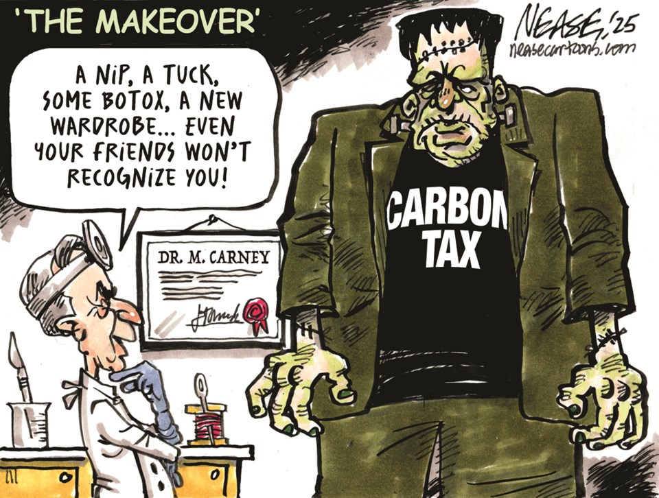
A recent interview exposes how centrist politics and climate obsession corrupt energy investments, in this case to the detriment of Canada. PM Carney is running a charade which will not bode well for Canada, according to this interview of Energy industry expert David Knight Legg by National Post’s Rob Brackenridge. Excerpts from the transcript are below with my bolds and added images. First a reminder of where PM Carney is coming from:
Greetings, folks, I’m Rob Brackenridge for National Post and NP Comment. Alberta has now officially submitted a proposal to the federal government Major Projects Office for a new pipeline to the West Coast. Presumably, that will be fast-tracked by the federal government. We’re expecting that designation of this being in the national interest from the Prime Minister by October. But is all of this enough to really get Canada to where it needs to be, to really fully embrace the opportunity that presents itself and to be that destination for investment and be a global energy superpower?
Well, someone who’s been watching all of this very closely is David Knight Legg. He is a director and an advisor to a number of energy, financial and tech firms, a former principal advisor to Alberta’s premier, former CEO at Invest Alberta Corporation. David, so great to have you with us here. Great to be here, Rob. Great to see you again. Likewise.
It’s been an interesting couple of days. Clearly, the current premier of Alberta has put a lot of work into this, and is trying to pull, I think, the federal government in a much different direction from where it’s been over the past decade. How significant is this milestone, do you think, first of all?
Well, Rob, you know, it’s always hard when you sit outside something as complicated as a negotiation between Ottawa and Alberta, which has skeptics in both their bases, as I’m sure you know. And I had a good conversation with Jason Nixon (Alberta Minister of Finance) last night about it, met the premier briefly. I think it’s really important and I think that it’s not perfect. These deals often aren’t.
But I think one of the testaments to how important it is, is how close it came to being derailed in a variety of ways, just as a little bit of the backstory. And I think that, you know, you sometimes have to take the win that you’ve got. Actually there are a lot of things I’d be critical about. I don’t think it goes far enough.
And I think we have a fundamental problem in a regulatory regime,
which means that governments have to get this involved
in getting basic infrastructure built.
In other countries, you don’t need governments announcing these things. You don’t need a most favored nation status for a project. You have very simple, clean regulations, low taxes, and you allow people to build as long as they meet basic criteria. And I think it’s the absence of that that has become more apparent to more people because of the MOU.
So I think one of the benefits of the MOU has been that it has started a conversation that’s been needed for a long time in Canada over just how hard it’s become to build anything here without official government sanction. And I think that’s a conversation that’s going to continue to persist as this project works its way forward. Yeah, even just the existence of the the major projects office, the Building Canada Act, I mean, it’s a recognition that we have all of this red tape in the way and we create this separate track to try to bypass it. But it just kind of leaves everything else still in place. Right.
So in a way, it’s an acknowledgement that we have that problem, but it doesn’t really address it at the same time. That’s a great that’s a great point. In fact, I think that’s a great way to put it. And that’s actually a conversation that really needs a national conversation that needs to happen.
If you have to create an entirely separate bureaucracy to avoid your current bureaucracy, it might be time to reform your current bureaucracy rather than set up a new set of channels and processes that ultimately are privileging things that still require the government to lean in. And it creates a greenhouse for favoritism and, you know, trying to get the attention of the government to trying to do things rather than a level playing field where anybody can come in and innovate and create. And I think as a nation, we’ve got to do better than this.
You know, it just it looks like 1970s style industrial policy rather than a fair, free, open, entrepreneur led marketplace of ideas and and opportunities. And you have to believe that there are really creative ways of thinking about things that would be initiated across Canada right now if the regulations were simple, the taxes were lower and the process was clear. We’re seeing under this prime minister a little bit of slow dismantling of a lot of the Trudeau legacy, which is maybe long overdue and perhaps needs to be expedited to some degree.
But what does it tell us about then the missed opportunity of the last decade and and all of the cost, all that was wasted as we sort of lived and endured under those policies? You know, Rob, I think one of the things that’s really interesting is Mark Carney was the heart of a lot of those policies. And, you know, half of me believes, you know, that’s what makes him the perfect guy to dismantle them because nobody else is going to be as credible with that liberal base as he would be at turning back some of the environmental overreach that’s restricted the ability to build in Canada. On the other hand, I think that there’s this temptation within this Carney government to maintain control over economic development in a way that means that they constantly have their hand on the wheel.
They’re constantly fidgeting with what they can release. And this is problematic because you will never have government sanctioned projects move as fast as projects that are originating in the private sector and originating with people that are, you know, have to make a bottom line work. So I think, you know, the dismantling of the Trudeau erais so important for the country to move forward, but that’s not sufficient. It’s essential, but it’s not enough to actually start to get the economy rolling again. And you saw this in this really odd condo deal that that happened and a lot of these things where there’s a constant attempt to use government money. We don’t have it.
You know, they’re borrowing it to expand the bureaucracy and also to expand the government reach into things like housing, energy. You know, these are sectors that in most countries are managed without the government having to intervene. Yeah.
And it’s interesting because you mentioned the economy, and obviously that’s an impetus. I know there’s provincial federal dynamics. There’s the energy side of things, but there’s just, you know, when you look at the economic challenges Canada is facing right now and how lethargic our economy has been, the global headwinds we’re facing, the trade uncertainty with the United States. If we’ve got economic advantages, if we’ve got strength, I mean, now’s the time to exploit those advantages. Is there a dawning realization, just with everything that we’re facing now, that we have all of this in front of us? I think so.
I think it started with a paper by Stephen Miran who went on to be the chairman of the Council of Economic Advisers for the US president back in November 24, when he said the United States should embark on this. This is what the president ended up adopting as formal policy, should embark on a process of integrating its national interests in energy security, military security, and trade security. And immediately they went for Panama. They’re doing deals around the Straits of Malacca. They’re, of course, active in the Straits of Hormuz with Iran, Greenland. They immediately went to taking Venezuelan oil over. I don’t think there’s been enough coverage of that, and that’s one of the things that led to the article that I wrote, which is when the Americans took over the Venezuelan energy supply, the Chinese lost 550,000 barrels of heavy crude, which is chemically identical to what we produce. It opens up an opportunity for us to have a $15 billion a year trade with the Chinese government just on that one replacement supply chain alone. And the idea that we had Northern Gateway effectively blueprinted already, that that’s a 565,000 barrel pipeline that could easily get there.
When you look at why Northern Gateway was ultimately cancelled, it’s a series of just self-imposed rules that have nothing to do with ultimately helping the environment, even though they’re dressed up that way. When you double-click on those rules, they do nothing for the environment, and in some ways they just sort of imagine that Canada can’t do things. We look at a tanker ban and we think the whole world is moving this stuff by tank. Are we the only country incapable of operating shipping and ports in environmentally sensitive areas? We don’t back ourselves enough to figure out that we could still do it as Canadians if they can do it in 50 other countries.
So there’s a lot that I think happened during that Trudeau era that we’re going to have to answer for. And I think we’re starting at least to have the right conversations. And yesterday’s announcement was an important step towards, I think, government saying we need this pipeline. I still dislike the fact they’re putting themselves in the position of being the ones to back it and treating pipelines more like airports or something. That is maybe being realistic about what you do if you do have a kind of very statist government environment. But it would be better if we could go back to a being a nation where free market entrepreneurialism didn’t require a constant government sanction. Yeah, there’s that.
I mean, I think one of the positives here, I mean, with Trans Mountain, we faced a real backlog when it came to the capacity pipeline capacity. Right. So with this, I think there’s the investment, the spinoff that comes with increasing production to fill this pipe and to fill some of the other projects like South Bow or like the Enbridge Mainline expansion, that the expansion, the growth of production is where we could really see a lot of that investment in the economic spinoffs.
How much does that tie into this? Do you think? Look, I think it’s super important. These are supply demand cycles. And the demand side, when you look at Asia, is unprecedented. You know, and so I think that’s a really the point you’re making is critical. I think you could double or we could get to 10 million barrels. Ultimately, there would be no problem in terms of egress and demand.
Almost all the issues related to the investability of that process are tied to issues like whether or not pathways and CCUS (Carbon Capture) is really the most important thing in the world. Or is it more important than some of these commitments to actually produce and supply and ship? And I think that it’s not. You know, our lesson from a lot of the environmental and to the Prime Minister’s credit, he came out and said $200 billion in 10 years of environmental activism from Ottawa produced absolutely nothing of note. It certainly didn’t change the emissions profile of the country in any significant way. In many ways, it harmed the ability for Canada to play a role in reducing global emissions by shipping a lot more of our gas to offset the coal-fired Chinese grid. And so in so many ways, I think there’s been a decade of strategic irrelevance, but also a decade of real economic decline.
And I think this Prime Minister is faced with needing to get over what’s happened in the trade arena. And I think they’re sort of turning a light past the fact that the Americans have said we’re going to do a deal with the Mexicans and not with the Canadians. You know, we’re going to put you guys on this annual review process. Now, a lot of people are saying that’s fine. I don’t think that’s fine. I think that’s an absolute failure to effectively negotiate the past 18 months. And that is starting to put in. I think the Prime Minister is smart enough to know deep down this is a real problem for the country and for him. And when you look at Canada, the Canadian balance sheet of exports, you know that energy is the only place where you’re going to get an immediate return economically on an investment.
So I think he’s still trying to juggle that kind of absolute realism about what works economically with his desire that there still be kind of a signaling effect, at least to his base, that they’re going to take care of the environment. But I’m just not sure when you look at, you know, sitting on the board of an energy company, you look at the costs related to all of these sort of exogenous environmental commitments that Canada is kind of inventing with the hope that it signals environmental commitments. But they’re not really making that big a difference to the planet. And they’re adding extraordinary costs. And they’re often being managed by government bureaucracies that don’t move at the speed of business or commercial interests. So I think it’s an important step.
It’s raising some important conversations. But I think the answers to some of those questions, those conversations are raising are going to take us further down the path of a much more liberalized economy when it comes to energy and hopefully a smaller government, a government that can live within its means federally and provincially. Yeah, I guess that’s the takeaway here, right? I mean, you know, it’s fine to say that this is a positive achievement. This is a project that is worthwhile, but to avoid maybe patting ourselves on the back too much and recognize some of these broader challenges we face, what do you think should be the next step here? Rather than just say, see this major projects office, this approach is working to have more meaningful conversation about taxes, about regulation, about just the whole picture. Is that really where the conversation ought to be going?
Yeah, look, I think you’re doing it right now, Rob. I think that this kind of conversation that you’re initiating is really important because I think that the baseline is that we want this nation to succeed. We want Alberta to succeed. We want Canada to succeed. We know that, and I think we’ve been sort of avoiding the fact that we’ve allowed the economy to decline and we’ve become very, very dependent on the United States as a result of that.
I mean, one of the great ironies of the past decade is that by refusing to build these things that would have taken our energy to Asia and to Europe, we’ve created a much deeper dependency on the U.S. markets in every way and across every category. And that dependency is now starting to really hurt us. And I think Ontario is an especially tough, tough place when it comes to this.
But I think the first step here is to start to lay out the way forward. And one of the obvious things to do is look at other nations and say, how are they creating these things in a way that’s actually getting things done? You look at a place, I’ve been spending some time in the United Arab Emirates, which is home to both Abu Dhabi and Dubai. And they just decided in the middle of this war that the Straits of Hormuz were not secure enough.
And so they’re going to build a pipeline. They’re going to have that pipeline done in under a year. And that’s going to move 1.8 million barrels of oil. And when you hear that, you sort of think, makes sense. But then you think, imagine if Canada said, we’re going to build a pipeline, 1.8 million, we’re going to have it done in a year. And we’re going to get this stuff to China as a result of what happened in Venezuela.
Here’s the burning question for me. Why not? Why can’t we be that nation? Half the people building these infrastructure projects in the UAE are coming from Canada, because we’re the best in the world at these things. But those experts can’t build those things in Canada at that speed, because they’re beholden to a series of rules that are often rooted in what used to feel like benign green commitments.
But now we just realize these are constraints that are doing nothing for the planet. And they’re significantly slowing down our ability to actually build the kind of economic stability and security and growth we need.
And I really like the framing that you gave about this event. Yes, this step is good. But before we start celebrating, let’s consider where does this actually go next? Are we still talking about a five to 10 year build process? Is that real? Why can they build something in a year in the UAE that carries almost twice the amount of oil as what we can build? And if there’s geographic or geological reasons why, that’s fine. But I don’t think that’s the case.
I think a lot of it is that we’ve just grown used to and accustomed to operating in a manner that is second rate. And it doesn’t keep up with the speed of business. And it certainly doesn’t keep up with what’s happening globally in the world of energy security and energy supply.
The best context for understanding decadal temperature changes comes from the world’s sea surface temperatures (SST), for several reasons:
The ocean covers 71% of the globe and drives average temperatures;
SSTs have a constant water content, (unlike air temperatures), so give a better reading of heat content variations;
A major El Nino was the dominant climate feature in recent years.
Previously I used HadSST3 for these reports, but Hadley Centre has made HadSST4 the priority, and v.3 will no longer be updated. This February report is based on HadSST 4, but with a twist. The data is slightly different in the new version, 4.2.0.0 replacing 4.1.1.0. Product page is here.
The Current Context
The chart below shows SST monthly anomalies as reported in HadSST 4.2 starting in 2015 through June 2026. A global cooling pattern is seen clearly in the Tropics since its peak in 2016, joined by NH and SH cycling downward since 2016, followed by rising temperatures in 2023 and 2024 and cooling in 2025, now with a steady mild rising in 2026 pausing in May and resuming in June.
Note that in 2015-2016 the Tropics and SH peaked in between two summer NH spikes. That pattern repeated in 2019-2020 with a lesser Tropics peak and SH bump, but with higher NH spikes. By end of 2020, cooler SSTs in all regions took the Global anomaly well below the mean for this period. A small warming was driven by NH summer peaks in 2021-22, but offset by cooling in SH and the tropics, By January 2023 the global anomaly was again below the mean.
Then in 2023-24 came an event resembling 2015-16 with a Tropical spike and two NH spikes alongside, all higher than 2015-16. There was also a coinciding rise in SH, and the Global anomaly was pulled up to 1.1°C in 2023, ~0.3° higher than the 2015 peak. Then NH started down autumn 2023, followed by Tropics and SH descending 2024 to the present. During 2 years of cooling in SH and the Tropics, the Global anomaly came back down, led by Tropics cooling from its 1.3°C peak 2024/01, down to 0.5C in November 2025. That same month, the Global anomaly exactly matched the mean for this period, with all regions converging on that value, lincluding a 5 month drop in NH. Now in 2026, warming is due to a six-month rise in NH and Tropics, plus SH the first three months. The Global anomaly in June matched the value 2 years ago, and NH is also the same as June 2024.
Comment:
The climatists have seized on this unusual warming as proof their Zero Carbon agenda is needed, without addressing how impossible it would be for CO2 warming the air to raise ocean temperatures. It is the ocean that warms the air, not the other way around. Recently Steven Koonin had this to say about the phonomenon confirmed in the graph above:
El Nino is a phenomenon in the climate system that happens once every four or five years. Heat builds up in the equatorial Pacific to the west of Indonesia and so on. Then when enough of it builds up it surges across the Pacific and changes the currents and the winds. As it surges toward South America it was discovered and named in the 19th century It iswell understood at this point that the phenomenon has nothing to do with CO2.
Now people talk about changes in that phenomena as a result of CO2 but it’s there in the climate system already and when it happens it influences weather all over the world. We feel it when it gets rainier in Southern California for example. So for the last 3 years we have been in the opposite of an El Nino, a La Nina, part of the reason people think the West Coast has been in drought.
It has now shifted in the last months to an El Nino condition that warms the globe and is thought to contribute to this Spike we have seen. But there are other contributions as well. One of the most surprising ones is that back in January of 2022 an enormous underwater volcano went off in Tonga and it put up a lot of water vapor into the upper atmosphere. It increased the upper atmosphere of water vapor by about 10 percent, and that’s a warming effect, and it may be that is contributing to why the spike is so high.
A longer view of SSTs
To enlarge, open image in new tab.
The graph above is noisy, but the density is needed to see the seasonal patterns in the oceanic fluctuations. Previous posts focused on the rise and fall of the last El Nino starting in 2015. This post adds a longer view, encompassing the significant 1998 El Nino and since. The color schemes are retained for Global, Tropics, NH and SH anomalies. Despite the longer time frame, I have kept the monthly data (rather than yearly averages) because of interesting shifts between January and July. 1995 is a reasonable (ENSO neutral) starting point prior to the first El Nino.
The sharp Tropical rise peaking in 1998 was dominant in the record, starting Jan. ’97 to pull up SSTs uniformly before returning to the same level Jan. ’99. There were strong cool periods before and after the 1998 El Nino event. Then SSTs in all regions returned to the mean in 2001-2.
SSTS fluctuate around the mean until 2007, when another, smaller ENSO event occurs. There is cooling 2007-8, a lower peak warming in 2009-10, following by cooling in 2011-12. Again SSTs are average 2013-14.
Now a different pattern appears. The Tropics cooled sharply to Jan 11, then rise steadily for 4 years to Jan 15, at which point the most recent major El Nino takes off. But this time in contrast to ’97-’99, the Northern Hemisphere produces peaks every summer pulling up the Global average. In fact, these NH peaks appear every July starting in 2003, growing stronger to produce 3 massive highs in 2014, 15 and 16. NH July 2017 was only slightly lower, and a fifth NH peak still lower in Sept. 2018.
The highest summer NH peaks came in 2019 and 2020, only this time the Tropics and SH were offsetting rather adding to the warming. (Note: these are high anomalies on top of the highest absolute temps in the NH.) Since 2014 SH has played a moderating role, offsetting the NH warming pulses. After September 2020 temps dropped off down until February 2021. In 2021-22 there were again summer NH spikes, but in 2022 moderated first by cooling Tropics and SH SSTs, then in October to January 2023 by deeper cooling in NH and Tropics.
Then in 2023 the Tropics flipped from below to well above average, while NH produced a summer peak extending into September higher than any previous year. Despite El Nino driving the Tropics January 2024 anomaly higher than 1998 and 2016 peaks, following months cooled in all regions, and the Tropics continued cooling in April, May and June along with SH dropping. After July and August NH warming again pulled the global anomaly higher, September through January 2025 resumed cooling in all regions, continuing February through April 2025, with little change in May,June and July despite upward bumps in NH. Temps in all regions cooled from August through November 2025, followed by a rebound of mild warming in 2026 appears in all regions through April Pausing in May and resuming in June.
What to make of all this? The patterns suggest that in addition to El Ninos in the Pacific driving the Tropic SSTs, something else is going on in the NH. The obvious culprit is the North Atlantic, since I have seen this sort of pulsing before. After reading some papers by David Dilley, I confirmed his observation of Atlantic pulses into the Arctic every 8 to 10 years.
Contemporary AMO Observations
Through January 2023 I depended on the Kaplan AMO Index (not smoothed, not detrended) for N. Atlantic observations. But it is no longer being updated, and NOAA says they don’t know its future. So I find that ERSSTv5 AMO dataset has current data. It differs from Kaplan, which reported average absolute temps measured in N. Atlantic. “ERSST5 AMO follows Trenberth and Shea (2006) proposal to use the NA region EQ-60°N, 0°-80°W and subtract the global rise of SST 60°S-60°N to obtain a measure of the internal variability, arguing that the effect of external forcing on the North Atlantic should be similar to the effect on the other oceans.” So the values represent SST anomaly differences between the N. Atlantic and the Global ocean.
The chart above confirms what Kaplan also showed. As August is the hottest month for the N. Atlantic, its variability, high and low, drives the annual results for this basin. Note also the peaks in 2010, lows after 2014, and a rise in 2021. Then in 2023 the peak reached 1.4C before declining to 0.9 August 2026. An annual chart below is informative:
Note the difference between blue/green years, beige/brown, and purple/red years. 2010, 2021, 2022 all peaked strongly in August or September. 1998 and 2007 were mildly warm. 2016 and 2018 were matching or cooler than the global average. 2023 started out slightly warm, then rose steadily to an extraordinary peak in July. August to October were only slightly lower, but by December cooled by ~0.4C.
Then in 2024 the AMO anomaly started higher than any previous year, then leveled off for two months declining slightly into April. Remarkably, May showed an upward leap putting this on a higher track than 2023, and rising slightly higher in June. In July, August and September 2024 the anomaly declined, and despite a small rise in October, ended close to where it began.
Note 2025 started much lower than the previous year and headed sharply downward, well below the previous two years, and since April through September aligning with 2010. In October there was an unusual upward spike, now reversed down to match 2022 and 2016. The orange 2026 line started downward and is visible on top of 2016 purple line, then slightly higher, but now matching 2016 and well below the peak years of 2023 and 2024.
The pattern suggests the ocean may be demonstrating a stairstep pattern like that we have also seen in HadCRUT4.
The rose line is the average anomaly 1982-1996 inclusive, value 0.18. The orange line the average 1982-2025, value 0.41 also for the period 1997-2012. The red line is 2015-2025, value 0.74. As noted above, these rising stages are driven by the combined warming in the Tropics and NH, including both Pacific and Atlantic basins.
The oceans are driving the warming this century. SSTs took a step up with the 1998 El Nino and have stayed there with help from the North Atlantic, and more recently the Pacific northern “Blob.” The ocean surfaces are releasing a lot of energy, warming the air, but eventually will have a cooling effect. The decline after 1937 was rapid by comparison, so one wonders: How long can the oceans keep this up? And is the sun adding forcing to this process?
USS Pearl Harbor deploys Global Drifter Buoys in Pacific Ocean
The post below updates the UAH record of air temperatures over land and ocean. Each month and year exposes again the growing disconnect between the real world and the Zero Carbon zealots. It is as though the anti-hydrocarbon band wagon hopes to drown out the data contradicting their justification for the Great Energy Transition. Yes, there was warming from an El Nino buildup coincidental with North Atlantic warming, but no basis to blame it on CO2.
As an overview consider how recent rapid cooling completely overcame the warming from the last 3 El Ninos (1998, 2010 and 2016). The UAH record shows that the effects of the last one were gone as of April 2021, again in November 2021, and in February and June 2022 At year end 2022 and continuing into 2023 global temp anomaly matched or went lower than average since 1995, an ENSO neutral year. (UAH baseline is now 1991-2020). Then there was an usual El Nino warming spike of uncertain cause, unrelated to steadily rising CO2, and now dropping steadily back toward normal values.
For reference I added an overlay of CO2 annual concentrations as measured at Mauna Loa. While temperatures fluctuated up and down ending flat, CO2 went up steadily by ~66 ppm, an 18% increase.
Furthermore, going back to previous warmings prior to the satellite record shows that the entire rise of 0.8C since 1947 is due to oceanic, not human activity.
The animation is an update of a previous analysis from Dr. Murry Salby. These graphs use Hadcrut4 and include the 2016 El Nino warming event. The exhibit shows since 1947 GMT warmed by 0.8 C, from 13.9 to 14.7, as estimated by Hadcrut4. This resulted from three natural warming events involving ocean cycles. The most recent rise 2013-16 lifted temperatures by 0.2C. Previously the 1997-98 El Nino produced a plateau increase of 0.4C. Before that, a rise from 1977-81 added 0.2C to start the warming since 1947.
Importantly, the theory of human-caused global warming asserts that increasing CO2 in the atmosphere changes the baseline and causes systemic warming in our climate. On the contrary, all of the warming since 1947 was episodic, coming from three brief events associated with oceanic cycles. And in 2024 we saw an amazing episode with a temperature spike driven by ocean air warming in all regions, along with rising NH land temperatures, now dropping well below its peak.
Chris Schoeneveld has produced a similar graph to the animation above, with a temperature series combining HadCRUT4 and UAH6. H/T WUWT
With apologies to Paul Revere, this post is on the lookout for cooler weather with an eye on both the Land and the Sea. While you heard a lot about 2020-21 temperatures matching 2016 as the highest ever, that spin ignores how fast the cooling set in. The UAH data analyzed below shows that warming from the last El Nino had fully dissipated with chilly temperatures in all regions. After a warming blip in 2022, land and ocean temps dropped again with 2023 starting below the mean since 1995. Spring and Summer 2023 saw a series of warmings, continuing into 2024 peaking in April, then cooling off to the present.
UAH has updated their TLT (temperatures in lower troposphere) dataset for June 2026. Due to one satellite drifting more than can be corrected, the dataset has been recalibrated and retitled as version 6.1 Graphs here contain this updated 6.1 data. Posts on their reading of ocean air temps this month are ahead the update from HadSST4 I posted recently on May 2026 SSTs Cease Warming. These posts have a separate graph of land air temps because the comparisons and contrasts are interesting as we contemplate possible cooling in coming months and years.
Sometimes air temps over land diverge from ocean air changes. 2025 showed a sharp contrast between land and sea, first with ocean air temps falling in January recovering in February. Then in November and December SH land temps spiked while ocean temps showed litle change. In February 2026 NH land temps doubled, from Dec. 0.53C up to 1.14C last month. Despite SH land changing little, and Tropical land cooling, the Global land anomaly jumped up from 0.53 to 0.93C. That reversed in March with both NH land and Global land anomaly back down to 0.63C. That cooling offset SH Ocean warming doubling from 0.19C to 0.38C. In May was a warming spike in Tropics and SH ocean air while NH ocean air was flat. At the same time, Land air temps warmed in Tropics and NH while dropping in SH. The unusual end result for May was Global, Land and Ocean air temp anomalies all showing the same 0.53C. Now in June SH land dropped sharply along with some SH ocean cooling, pulling down Global anomalies.
Note: UAH has shifted their baseline from 1981-2010 to 1991-2020 beginning with January 2021. v6.1 data was recalibrated also starting with 2021. In the charts below, the trends and fluctuations remain the same but the anomaly values changed with the baseline reference shift.
Presently sea surface temperatures (SST) are the best available indicator of heat content gained or lost from earth’s climate system. Enthalpy is the thermodynamic term for total heat content in a system, and humidity differences in air parcels affect enthalpy. Measuring water temperature directly avoids distorted impressions from air measurements. In addition, ocean covers 71% of the planet surface and thus dominates surface temperature estimates. Eventually we will likely have reliable means of recording water temperatures at depth.
Recently, Dr. Ole Humlum reported from his research that air temperatures lag 2-3 months behind changes in SST. Thus cooling oceans portend cooling land air temperatures to follow. He also observed that changes in CO2 atmospheric concentrations lag behind SST by 11-12 months. This latter point is addressed in a previous post Who to Blame for Rising CO2?
After a change in priorities, updates are now exclusive to HadSST4. For comparison we can also look at lower troposphere temperatures (TLT) from UAHv6.1 which are now posted for June 2026. The temperature record is derived from microwave sounding units (MSU) on board satellites like the one pictured above. Recently there was a change in UAH processing of satellite drift corrections, including dropping one platform which can no longer be corrected. The graphs below are taken from the revised and current dataset.
The UAH dataset includes temperature results for air above the oceans, and thus should be most comparable to the SSTs. There is the additional feature that ocean air temps avoid Urban Heat Islands (UHI). The graph below shows monthly anomalies for ocean air temps since January 2015.
After sharp cooling everywhere in January 2023, there was a remarkable spiking of Tropical ocean temps from -0.5C up to + 1.2C in January 2024. The rise was matched by other regions in 2024, such that the Global anomaly peaked at 0.86C in April. Since then all regions have cooled down sharply to a low of 0.27C in January. In February 2025, SH rose from 0.1C to 0.4C pulling the Global ocean air anomaly up to 0.47C, where it stayed in March and April. In May drops in NH and Tropics pulled the air temps over oceans down despite an uptick in SH. At 0.43C, ocean air temps were similar to May 2020, albeit with higher SH anomalies. In November/December all regions were cooler, led by a sharp drop in SH bringing the Global ocean anomaly down to 0.02C. In 2026, ocean warming was evident, with Tropics and SH pulling up Global ocean air temps despite little rise in NH ocean. Now in June that has stopped with SH cooling and pulling down the Global ocean anomaly.
Land Air Temperatures Tracking in Seesaw Pattern
We sometimes overlook that in climate temperature records, while the oceans are measured directly with SSTs, land temps are measured only indirectly. The land temperature records at surface stations sample air temps at 2 meters above ground. UAH gives tlt anomalies for air over land separately from ocean air temps. The graph updated for June is below.
Here we have fresh evidence of the greater volatility of the Land temperatures, along with extraordinary departures by SH land. The seesaw pattern in Land temps is similar to ocean temps 2021-22, except that SH is the outlier, hitting bottom in January 2023. Then exceptionally SH goes from -0.6C up to 1.4C in September 2023 and 1.8C in August 2024, with a large drop in between. In November, SH and the Tropics pulled the Global Land anomaly further down despite a bump in NH land temps. February showed a sharp drop in NH land air temps from 1.07C down to 0.56C, pulling the Global land anomaly downward from 0.9C to 0.6C. Some ups and downs followed with returns close to February values in August. A remarkable spike in October was completely reversed in November/December, along with NH dropping sharply bringing the Global Land anomaly down to 0.52C, half of its peak value of 1.17C 09/2024. In 2026 January and February Global land rebounded up to 1.14C, led by a NH warming spike. That NH spike was reversed in March and April back down to 0.43C. In May the Global land anomaly went back up to 0.53C with all regions around that value. Note in June land temps in SH plunged nearly 0.6C down to 0.2C, pulling Global land anomaly down more than 0.1C.
The Bigger Picture UAH Global Since 1980
The chart shows monthly Global Land and Ocean anomalies starting 01/1980 to present. The average monthly anomaly is -0.02 for this period of more than four decades. The graph shows the 1998 El Nino after which the mean resumed, and again after the smaller 2010 event. The 2016 El Nino matched 1998 peak and in addition NH after effects lasted longer, followed by the NH warming 2019-20. An upward bump in 2021 was reversed with temps having returned close to the mean as of 2/2022. March and April brought warmer Global temps, later reversed
With the sharp drops in Nov., Dec. and January 2023 temps, there was no increase over 1980. Then in 2023 the buildup to the October/November peak exceeded the sharp April peak of the El Nino 1998 event. It also surpassed the February peak in 2016. In 2024 March and April took the Global anomaly to a new peak of 0.94C. The cool down started with May dropping to 0.9C, later months declined steadily until August Global Land and Ocean was down to 0.39C. then rose slightly to 0.53 in October, before dropping. to 0.3C in December. By May 2026 the anomaly was back up to 0.53C, now down to 0.39C in June.
The graph reminds of another chart showing the abrupt ejection of humid air from Hunga Tonga eruption.
TLTs include mixing above the oceans and probably some influence from nearby more volatile land temps. Clearly NH and Global land temps have been dropping in a seesaw pattern, nearly 1C lower than the 2016 peak. Since the ocean has 1000 times the heat capacity as the atmosphere, that cooling is a significant driving force. TLT measures started the recent cooling later than SSTs from HadSST4, but are now showing the same pattern. Despite the three El Ninos, their warming had not persisted prior to 2023, and without them it would probably have cooled since 1995. Of course, the future has not yet been written.


 The best context for understanding decadal temperature changes comes from the world’s sea surface temperatures (SST), for several reasons:


